Rothy's Bags Launch
Rothy's was launching its first category expansion into luxury handbags crafted with a blend of recycled and marine plastic.
Rothy's was launching its first category expansion into luxury handbags crafted with a blend of recycled and marine plastic.
As the largest product expansion to date, we wanted to create a website that would showcase the elegance of the new category while elevating the overall website experience and establishing Rothy's as a lifestyle brand.
Step 1: Competitive User Research
First, we identified key competitors to evaluate in the luxury bag space. Next, I designed a comparative A/B user research study to test competitive matchups against one another with a lookalike audience to gain a deeper understanding of customer expectations and preferences.
First, we identified key competitors to evaluate in the luxury bag space. Next, I designed a comparative A/B user research study to test competitive matchups against one another with a lookalike audience to gain a deeper understanding of customer expectations and preferences.
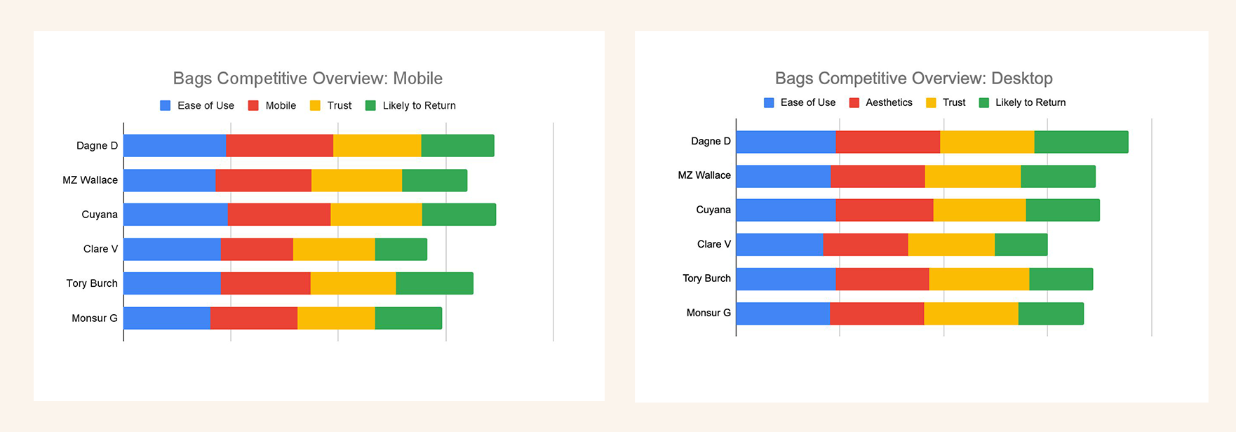
Aside from generating quick quantitative findings, we were also able to pull out key qualitative insights that informed our feature and content set while influencing a design that was tailored to our customer base.
We were able to learn how an item's price point affects expectations for how a product is presented to the customer. In essence, Rothy's new roster of high-priced luxury bags would require a new design template, separate from what had been used for selling shoes.
Step 2: Define and Scope
Support new product line launch across the site, including: updated navigation, homepage, product specific collection page, and updated product detail page.
Support new product line launch across the site, including: updated navigation, homepage, product specific collection page, and updated product detail page.
Mobile First Bags Collection Experience
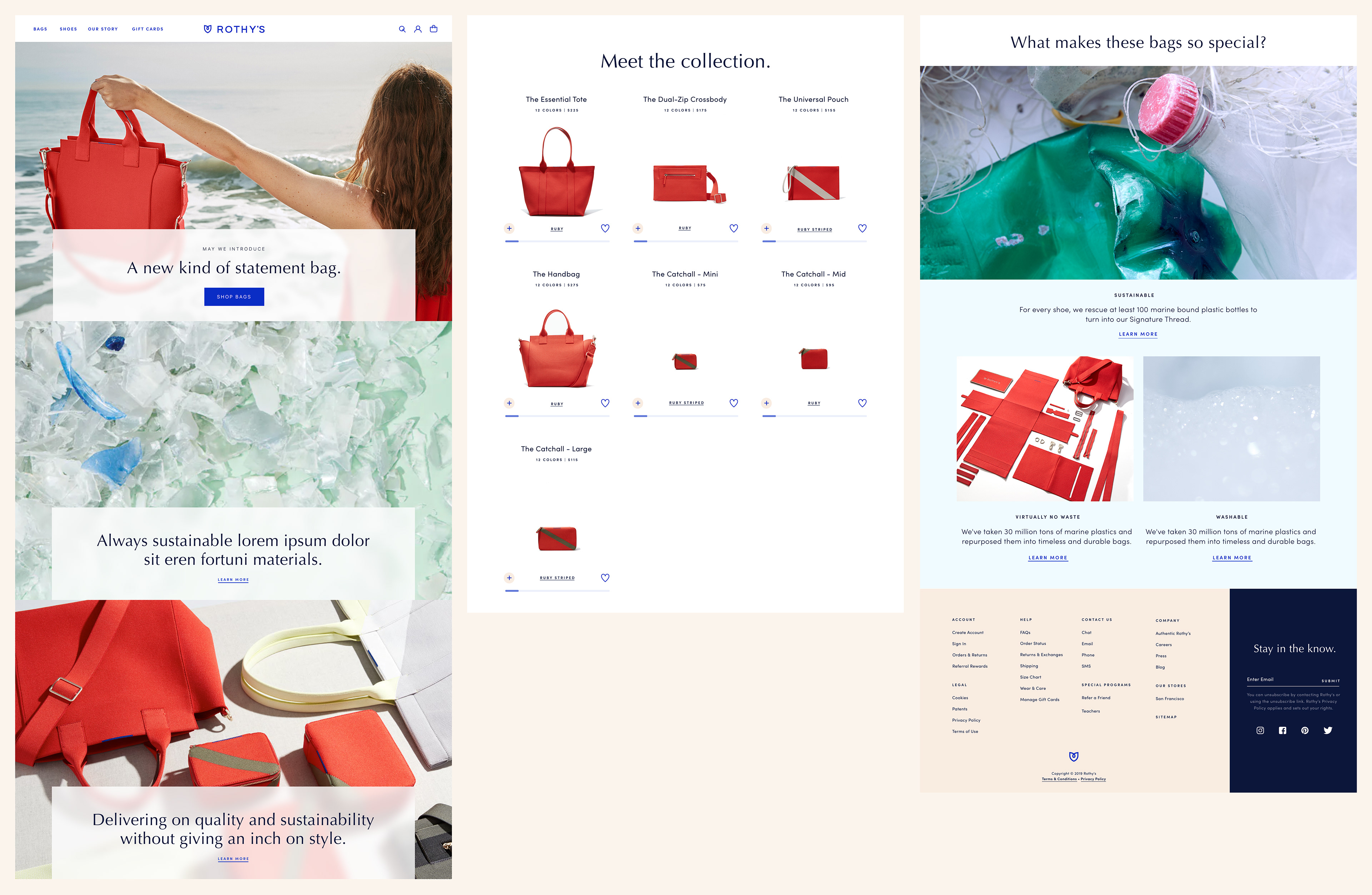
Desktop Bags Collection Experience
Step 3: Design - Mobile First Collection Page
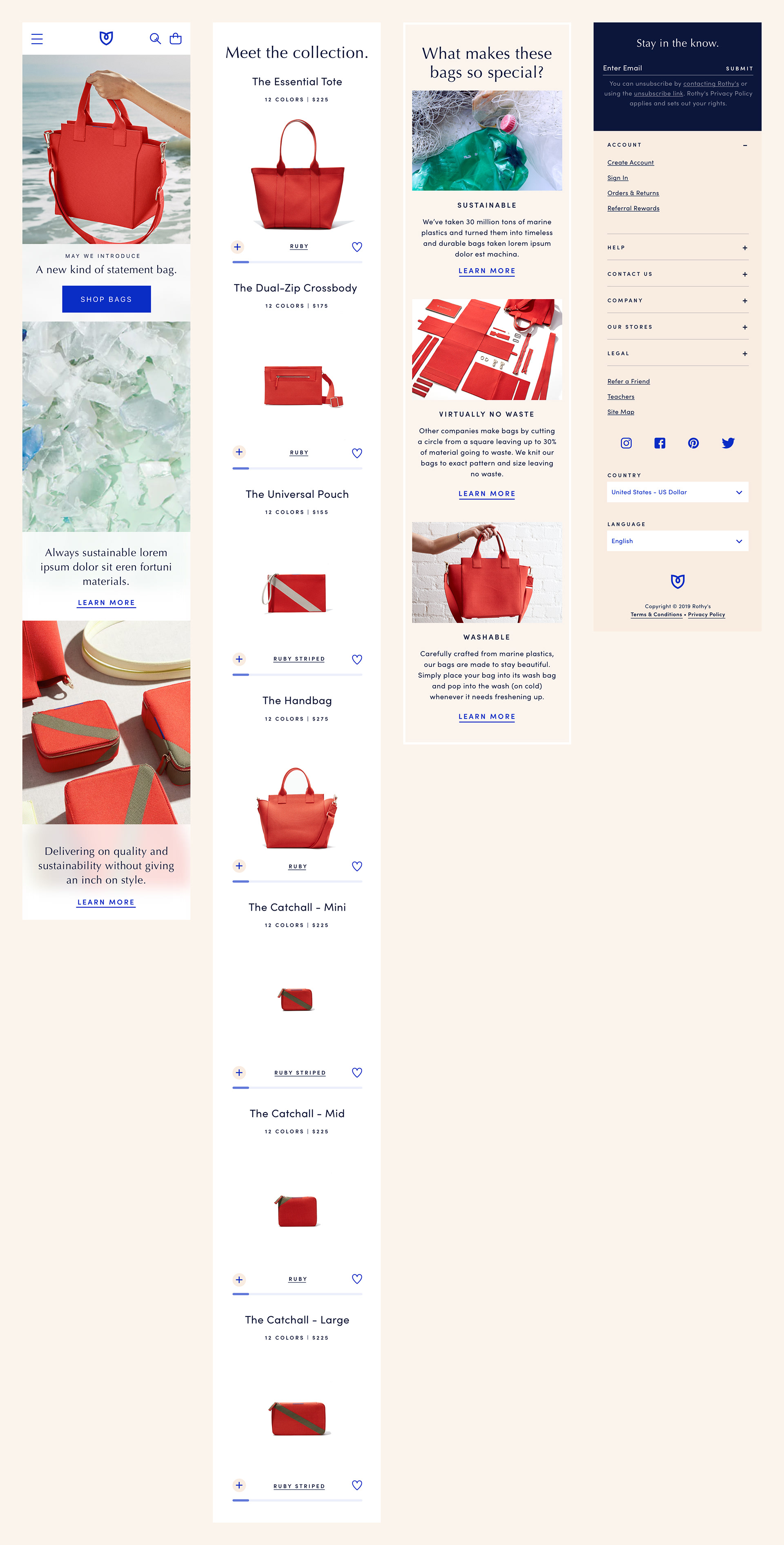
We wanted to create a unique and luxury experience befitting a luxury product. As part of that I designed a scrolling hero animation which allowed for a flexible number of feature images with accompanying text and CTAs.
We wanted to create a unique and luxury experience befitting a luxury product. As part of that I designed a scrolling hero animation which allowed for a flexible number of feature images with accompanying text and CTAs.
We knew that we wanted to provide users with the full product assortment where images are displayed proportionately so users can tell the size of a particular bag silhouette relative to another.
We also wanted to provide a way to shop and view all color and pattern options on the collection page.
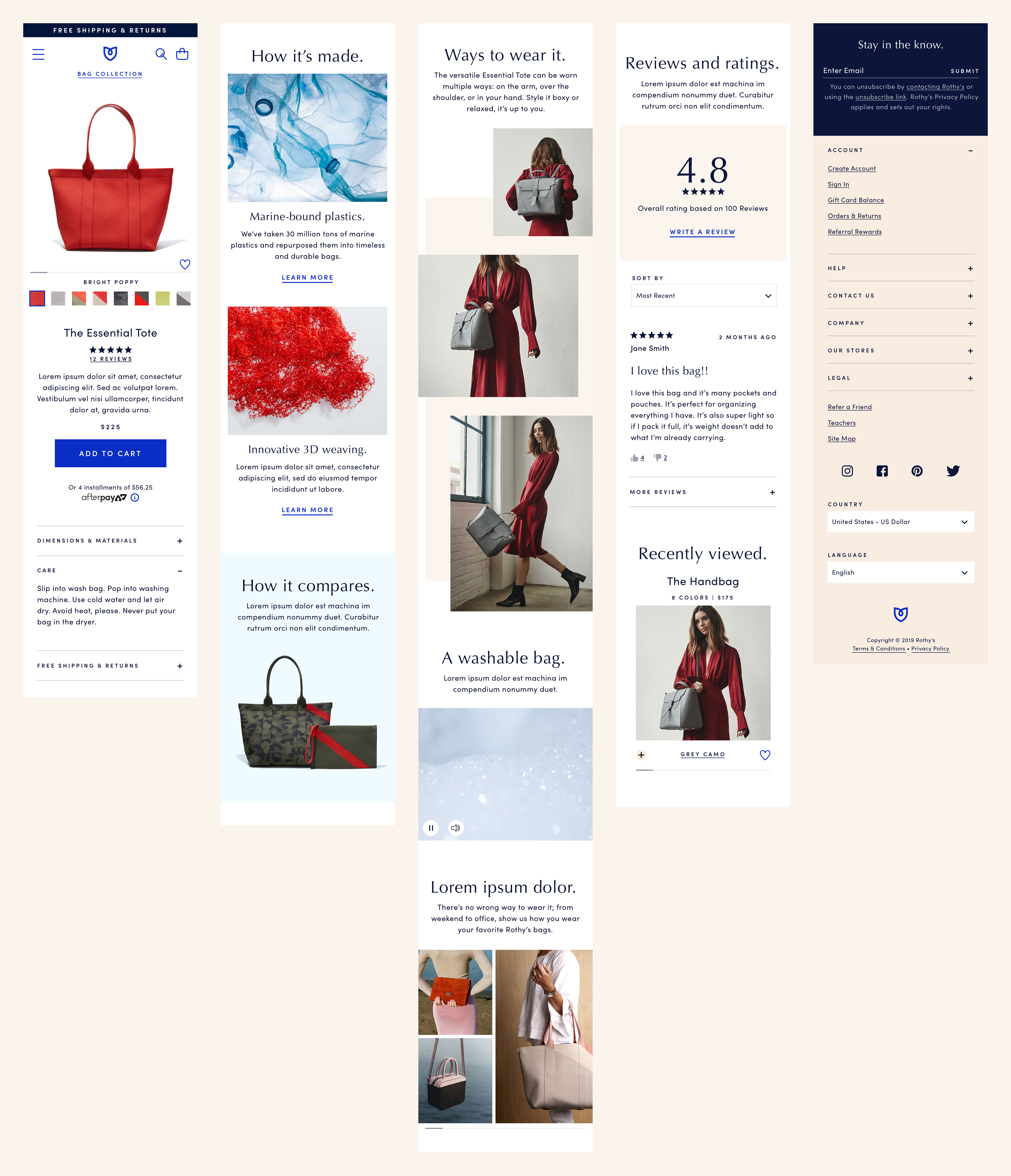
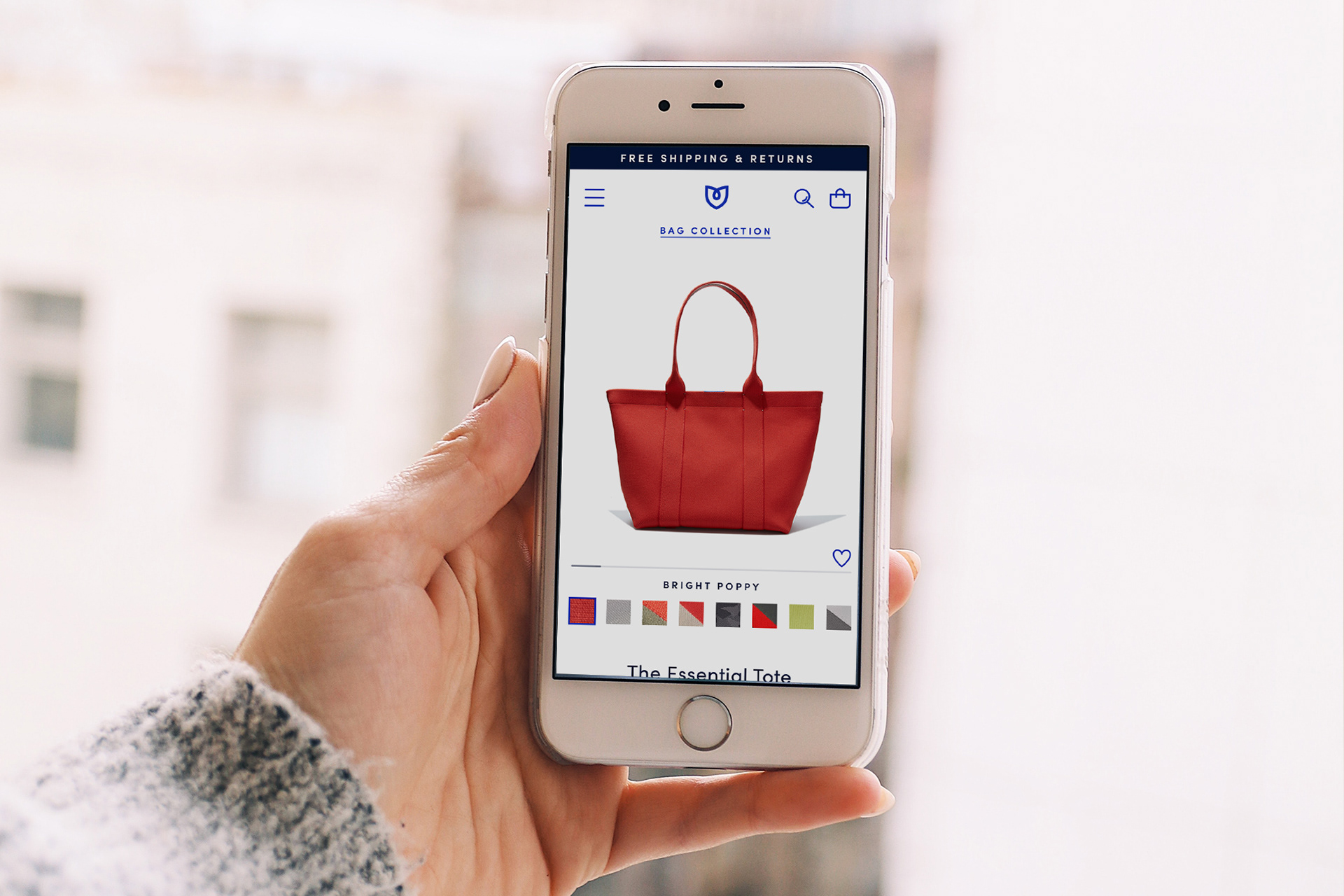
Mobile Bags PDP Experience
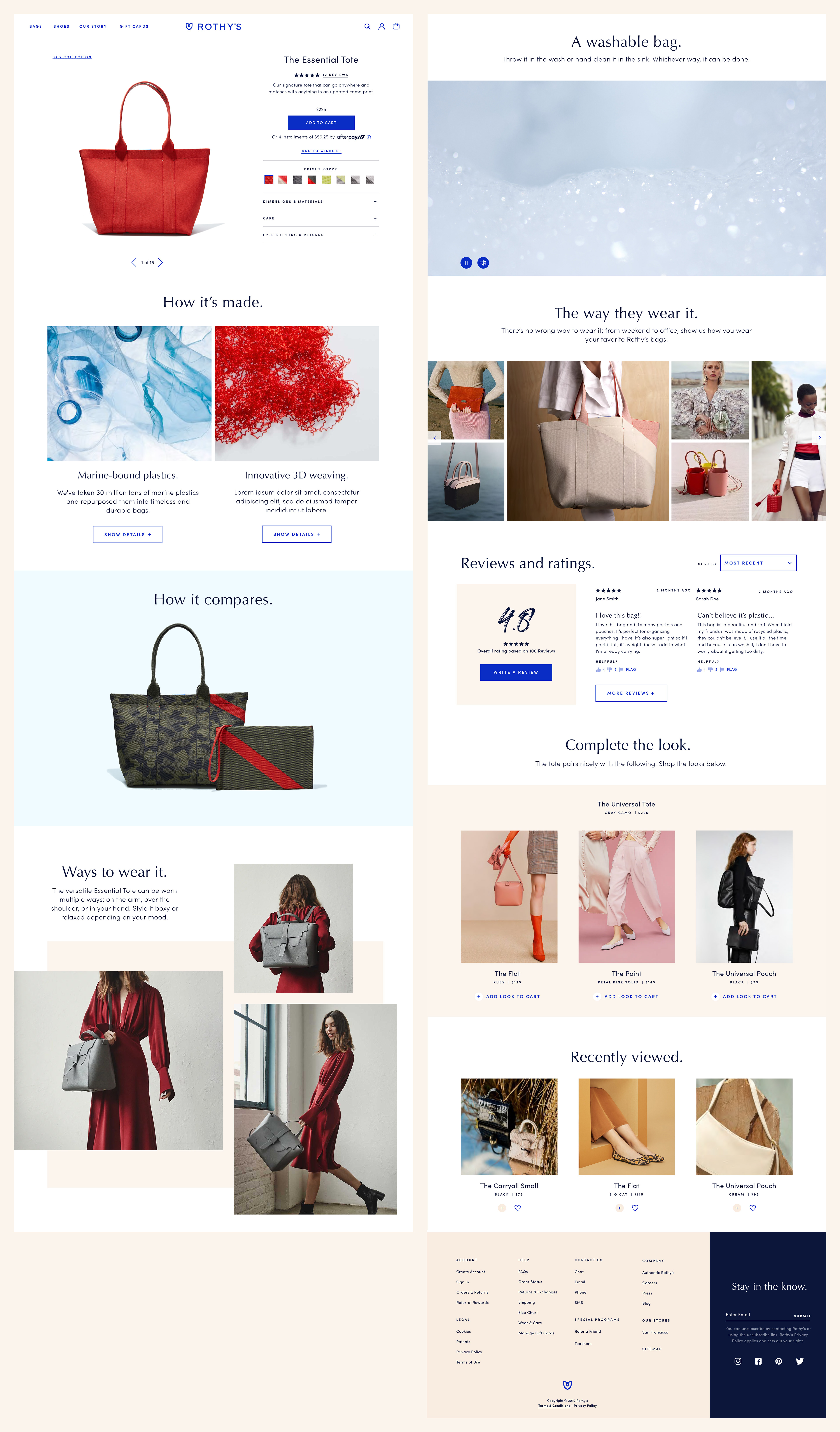
Desktop PDP Experience
Mobile First - Product Detail Page
We created a product detail page experience that allowed users to view all images per color and also switch between colors all in one view (without needing to scroll up and down).
We created a product detail page experience that allowed users to view all images per color and also switch between colors all in one view (without needing to scroll up and down).
We provided detailed information on how the new line of luxury bags were crafted and explanations of the unique materials used.
We learned from qualitative research that it was important to provide styling tips and model our bags in inspiring ways.
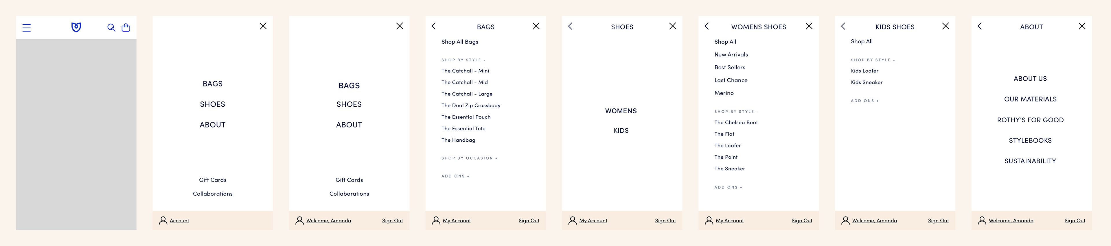
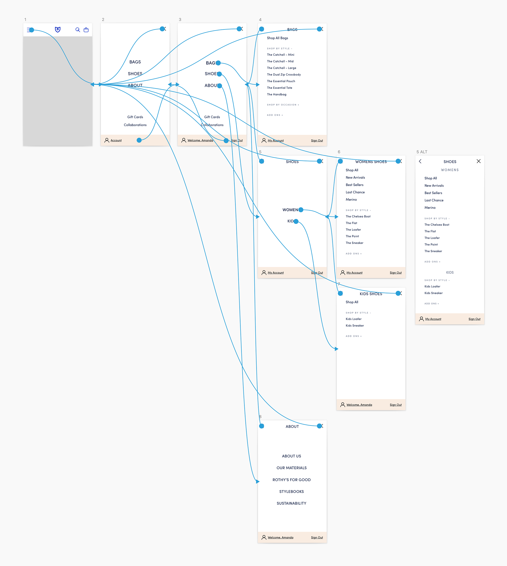
Revamped Mobile Navigation
As part of the expansion we also needed to revamp our mobile text-based navigation which involved multiple prototypes and rounds of usability testing.
As part of the expansion we also needed to revamp our mobile text-based navigation which involved multiple prototypes and rounds of usability testing.
We elected to stick with a clean and simple text based navigation based on user feedback.